Some meetings are more productive than others.
I remember sitting across the table from a client, watching with curiosity as they spread papers in front of me. Websites printed on 8.5 x 11-inch paper, awkwardly spilling off the page like the cakes of Nailed It.
Circles and arrows haphazardly marked the pages.
It was like The Office was paying homage to The Da Vinci Code.
As I took in the scene, these turned out to be their competitors’ websites. The client noticed a similar shade of green among them, as well as parallel pages (about us, services). Someone get Tom Hanks on the line! We’ve cracked the code.
To be clear, I’m not genuinely mocking. The business-owner-who-shall-not-be-named meant well. They were trying to do their homework and show up prepared. It’s an interesting study in what people see on the surface versus the underlying strategy.
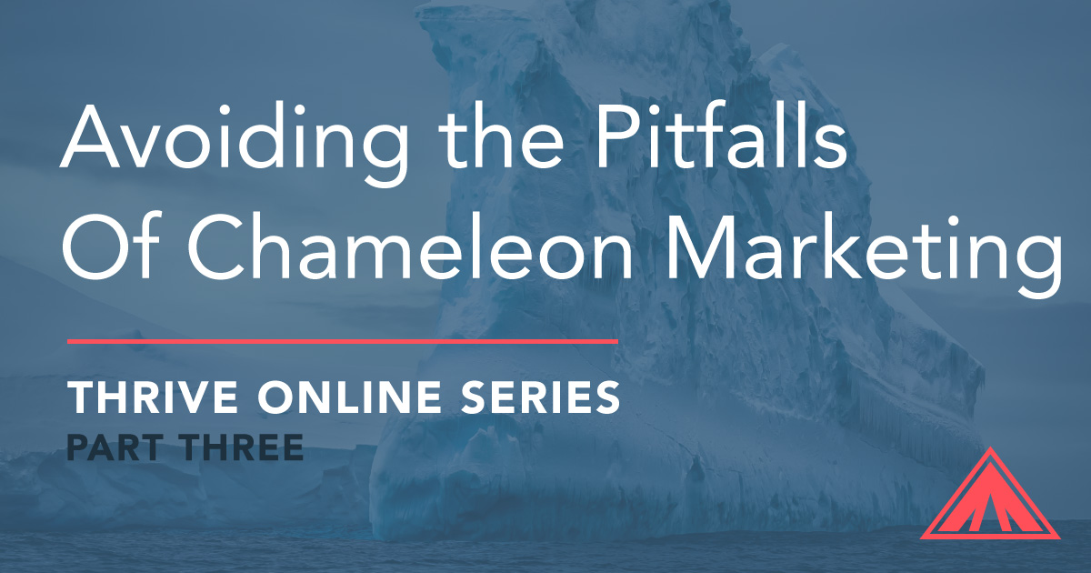
Is this the place for an iceberg metaphor? It’s either that or “under the hood,” and my last oil change was a nightmare, so let’s go iceberg.
Here’s what’s going on beneath the surface
The competitor is getting traffic from somewhere. It’s not divine intervention. There are auxiliary efforts getting people interested and clicking through to their website. Then they’re crafting offers and language specific to this audience to get them to email, call, sign up for a newsletter, or follow on social media.
Then what? The competitor has the attention of interested prospects. What are they doing to convert them into paying customers?
Attention is currency.
Gary Vaynerchuk has done a fantastic job distilling this concept. My mind has danced around the topic for a while. It’s not just the veneer, though design is important. It’s what you’re doing with the attention you earn.
Of course, there are good reasons to keep an eye on the competition.
Know what you’re up against. Consider what you can do better.
Avoiding Industry Tunnel Vision
Unfortunately, it’s a slippery slope to industry tunnel vision. Be careful not to choose which components to include on your website, or which aesthetic tone to use, solely because “the other guys are doing it.”
Try zooming out for a minute.
Here’s how to think outside the industry and avoid chameleon marketing.
If you’re designing or working with a designer:
Think about anything that has felt visually striking to you recently. It could be the openness of the path to your favorite beach or the window lettering on a new bakery. If nothing comes to mind, go for a walk with the intention of finding 5-10 things that contain visual appeal. This may seem abstract, but the more you look for a pattern in your surroundings, the easier it will be to tap into that instinct when you’re faced with a design choice.
If you’re deciding on functionality or customer experience:
Think about interactivity experiences that have felt smooth (no development or UX background required). Maybe it’s the app you ordered pizza through. Maybe it’s adding pictures to your kitchen renovation inspiration board. You aren’t looking to replicate these – just think about what felt smooth, what made it stand out to you. Consider if there are any steps on your website that could benefit from being similarly streamlined.
Stay in touch
Sign up for our newsletter and get updates as this series is released.
Follow Along


Stay in touch
Sign up for our newsletter and get updates as this series is released.
Follow Along

![Sleight of Handyman (Tools vs. Craft) – Thrive Online [Part 5]](https://ignitedesignagency.com/wp-content/uploads/2019/02/blog-cover-thrive-series-p5-500x383.jpg)
![Mindset: The Key To Better Outcomes – Thrive Online [Part 4]](https://ignitedesignagency.com/wp-content/uploads/2019/02/blog-cover-thrive-series-p4-500x383.jpg)
![Don’t Make Me Turn This Plane Around – Thrive Online [Part 2]](https://ignitedesignagency.com/wp-content/uploads/2019/01/blog-cover-thrive-series-p2-500x383.jpg)
Leave A Comment